
AMZN Stock Forecast Based on Algorithms: Amazon’s Chart of the Last 2 Months
I Know First, a startup company, has successfully predicted the price of Amazon throughout the last year and has a strong track record tracing back even further, by analyzing fundamental variables such as volatility, volume, and short-term trends. The chart shows the algorithm’s predictions for the past 2 months. Amazon (AMZN) forecast from April 25th 2014 till June 18th 2014. The forecast is based on the short and long term predictions of “I Know First” predictive algorithm. 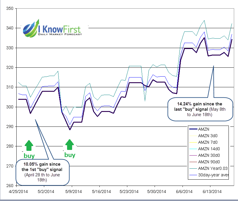
 How to read this chart? Each point on the chart was taken from the actual daily forecast published the morning before the next market open. The chart shows the actual price in thick blue. The positive or negative (Up or Down) signals of the forecast were added to the actual last known price at the time of forecast to result in signal lines. Thus, when the signal line is above the actual line, it means “buy,” if below, it means “sell”. The green and red arrows show what would be the best times to enter the market. The widely ranging signals are scaled relative to the previous average signal range to bring them into manageable scale to fit them all in one chart.
How to read this chart? Each point on the chart was taken from the actual daily forecast published the morning before the next market open. The chart shows the actual price in thick blue. The positive or negative (Up or Down) signals of the forecast were added to the actual last known price at the time of forecast to result in signal lines. Thus, when the signal line is above the actual line, it means “buy,” if below, it means “sell”. The green and red arrows show what would be the best times to enter the market. The widely ranging signals are scaled relative to the previous average signal range to bring them into manageable scale to fit them all in one chart.