
Treasury Yield Curve: An Indicator Of The Economic Health
 The article was written by Hieu Nguyen, a Financial Analyst at I Know First.
Summary:
- Definition and the importance of Yield Curve
- Four types of Yield Curve and two types of Yield Curve movements
- How to use Yield Curve to predict the health of the economy
- Three groups of interest rate sensitive stocks to look for
For a long time, yield curve has been a hot topic in the financial world. Many believe it to be a good signal of the economic health. However, how each stock response to the changes in interest rate and the movement of the yield curve is still a big question. I Know First has successfully built up Artificial Intelligence algorithms that factors yield curve and its relationship with other economic indicators to forecast the market movement. In this article, we will discuss how to use yield curve as a market prediction indicator as well as how I Know First algorithms factor it.
What is Yield Curve and Why is it important?
Yield Curve is a graphical depiction showing different interest rates or yields for different time periods ranging from 1 month to 30 years. Yield Curve reflects the relationship between the yield of the interest rate on bonds and its maturity. Every bond has different risks associated with it. Hence, it is difficult to compare the yield curve for different bonds in different time frame. As a result, we will focus on the yield curve for US Treasury market in this article. The US Treasury market is the largest bond market with high liquidity. Moreover, investors consider the market to be free of default risks.
Yield curve plays an important role in the economy as a benchmark for bond pricing and standard yield for other bond sectors such as bank loans or corporate debt. Yield curve can be used to calculate bond price by discounting the future cash flow of the bond at the yield of a particular time frame. As a result, if the yield increase, the price of the bond will decrease. Also, we can understand the risk associated with a bond by looking at the spread between it and the same maturity Treasury bond. This spread may depend on the creditworthiness of the debt issuers. Moreover, the bond market size is double the size of the stock market. Hence, every movement on the bond market will highly impact the whole macroeconomic picture.
Four types of Yield Curve
There are four major types of yield curve: normal yield curve, steep yield curve, flat yield curve, and inverted yield curve. The shape of the yield curve is a good signal for the market expectations of the whole economy. The shape of yield curve shows whether investors are optimistic or pessimistic about the economy.
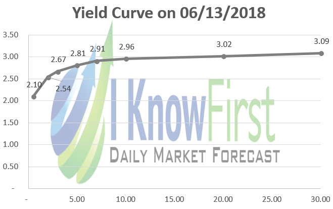
Normal yield curve: it is the most common type of yield curve. The short-term bill will have lower yield than the long-term bond. In this type of yield curve, the maturity spread between maturities is positive but less than 300 basis points. Moreover, the spread among maturities will decrease as the maturity increases. As the result, the tail of the yield curve will be flatter. The yield curve will be normal in a stable economic condition, showing a reliable long-term economy.
Steep yield curve: this type of yield curve is very similar to the normal yield curve. However, the spread between lower maturity yields and higher maturity yields is more than 300 basis points. Consequently, the tail of the yield curve will still be steep. Yield curve normally becomes steeper as the economy grows fast. We can witness a steep yield curve during the time 2010 to 2011 when the economy was strongly recovering from the global crisis in 2008. According to World Bank, the US GDP growth rate bumped up to 2.53% and 1.60% in these two years, compared to -0.29% in 2008 and -2.78% in 2009.
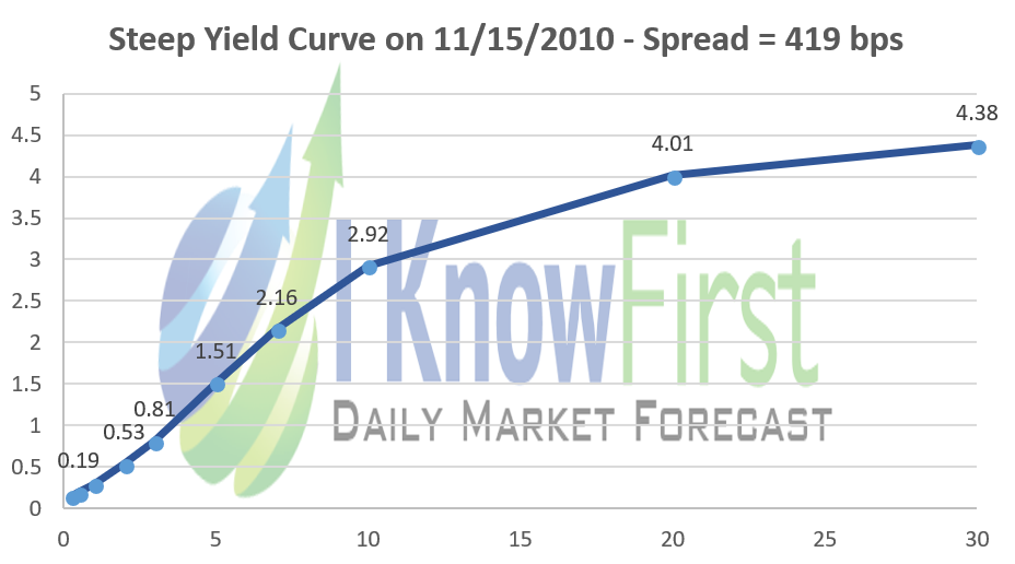
(Data Source: US Department of the Treasury)
Flat yield curve: is a shape when there is no much differences among all yields. The difference between 30-year bond yield and 6-month bill is less than 10 basis points. A flat yield curve may suggest an uncertain economic situation. This kind of yield curve can be witnessed after a long time of a high economic growth period. The investors may expect the momentum to disappear, slowing down the economic growth. The inflation may increase, and the central bank may raise the interest rate. As a result, the investor may require a relative high yield for a short-time bill compared to a long-term bond.
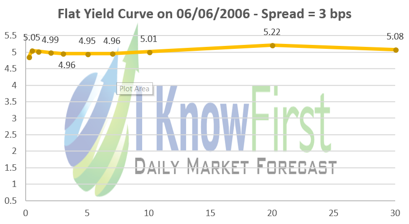
(Data Source: US Department of the Treasury)
Inverted yield curve: refers to a yield in which the long-term debt has lower yield than the short-term one. An inverted yield curve normally occurs after a short period of flat yield curve. It can easily be witnessed months before a crisis. An inverted yield curve is a signal for the pessimistic of investors about the health of the economy. As investors do not held a strong belief in the short-term outlook of the economy, they will require a higher yield for short-term debt. Later in this article, we will discuss further about this type of yield curve.

(Data Source: US Department of the Treasury)
Yield Curve Movements and Its Meaning
Besides the shape of a yield curve, another remarkable indicator is the movement of the yield curve. Obviously, the yield curve cannot come from steep one to an inverted one overnight. There are two main types of yield curve shift: parallel shift, and nonparallel shift. In a parallel movement, the yields for different maturity shift at a relatively same amount. On the other hand, in a nonparallel shift, the yield curve will become steeper or flatter. A flattening indicates a decrease in maturity spread while a steeping shows the reverse. However, the yield curve movements are not independent. An upward shift normally comes with a flattening of the yield curve when a downward shift can combine with a steeping one.

(Data Source: US Department of the Treasury)
Can Yield Curve be a prediction indicator of the economy?
As we understand more about the yield curve, the question now is how to interpret the shape and movement of yield curve to predict the health of the economy. Over the last 50 years, yield curve has proved itself as a good prediction indicator of an incoming financial crisis. As we mentioned above, a financial crisis normally followed an inverted yield curve. The last two times we saw an inverted yield curve is in 2000, right before dot-com bubble, and 2007, right before the global financial crisis.

(Data Source: US Department of the Treasury)
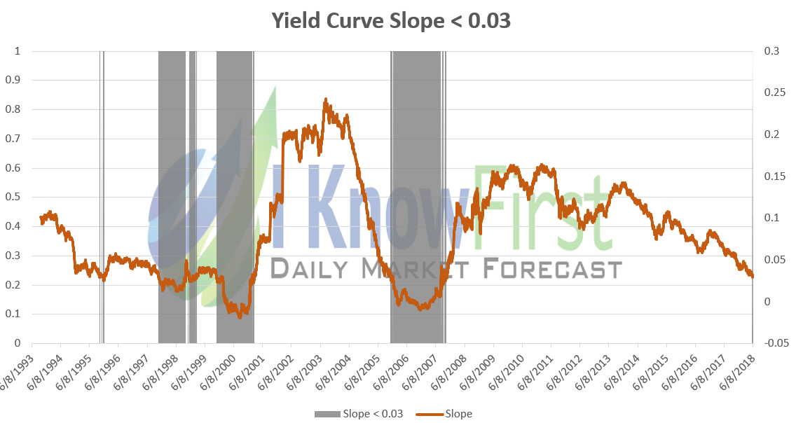
Looking forward to the trend of the yield curve, we can see that a flat yield curve will follow a period of downward movement. In 2004, around 2 years before an inverted yield curve, investors can see a fast-downward trend of the yield curve slope. On June 8th, 2006, 14 months before the crisis, the yield curve inverted. On February 27, 2007, around 8 months before the crisis, it reached rock bottom. The spread between 30-year bond and 6-month bill is -54 basis points, the lowest spread since the dot-com crisis in 2000.
(Data Source: US Department of the Treasury)
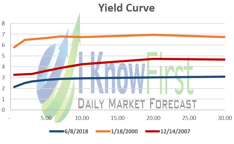
On the same hand, we can see a downward trend of the yield curve started from 2012. Although the slope of the trend is lower the 2006-2008 trend, it may still lead to a flat yield curve. On May 29th, 2018, the spread hit 90 basis points. The last time we saw that low spread is in November 2007. Moreover, the shape of the current yield curve is very similar to the one in January 2000, and December 2007, right before the two crises. However, we can also see that the current yield curve is far below the other two. As we discussed above, a flat yield curve will come with an upward movement, which indicates an increase in interest rate. As a result, it should be a time to have a closer look at lists of stock that are sensitive to interest rate.
(Data Source: US Department of the Treasury)
What stocks to look for?
Not all stocks respond the same way to changes in interest rate. In December 2016, Federal Reserve raised Fed fund rate for the first time after the crisis. There were three groups that have been highly sensitive to the increase of interest.
Bank and Finance: Undoubtedly, since the business model of this group depends on the interest rate, they will be on top of the lists of interest rate sensitive companies. In 18 months, this group has witnessed a strong growth in the top stocks including Bank of America (NYSE: BAC), Goldman Sachs (NYSE: GS), and JP Morgan (NYSE: JPM)
Automotive Industry: The second group to have a look is automotive industry. If the industry recovers, there will be higher demand for this industry. In fact, since 2016, both General Motors (NYSE: GM), and Tesla (NYSE: TSLA) has increased more than 60%. However, if the crisis happened, this industry will be one of the first industries to be influenced.
Capital Goods: The demand and supply of this group will also be impacted by the interest rate. As the interest rate started to recover in 2016, signaling a better economic health, the demand for this group also increased. On the other hand, on 2008, during the crisis, this group has suffered a significant hit. Boeing (NYSE:BA) lost 60% of its market capital while Honeywell (NYSE: HON) also lost one-third of its price.
Interest Rates in I Know First Model of the Market
From 2016, I Know First has correctly forecasted the movement of the stocks in all these three sectors. The company’s AI Algorithms take interest rate as one of the inputs, improving the accuracy of forecasting interest rate sensitive stocks. I Know First financial universe model is built exclusively by Artificial Intelligence means with no a priori knowledge of the economy. Through machine learning of historical data comprising thousands of inputs, it has identified the most important variables affecting the future of the economy. It turns out, the inputs related to the yield curve are among the most significant overall, confirming independently the human interpretation discussed in this article.
Moreover, analysis of the I Know First model reveals finer details of each stock and industry groups dependence on interest rates and other variables, such as currency ratios or oil prices. Through ‘what if’ simulations of the model, the complex interactions between different variables affecting stock price can be revealed, providing us with a knowledge of each company sensitivity to macro market conditions. This allows to compare different companies and industries and forecast how they would perform at different economic environments.
- Boeing Stock Analysis: Here Is A Better Way To Fly
- Bank of America Benefits From Increase in Interest Rates
- JPM Stock Analysis: JPMorgan Set to Surge in 2017
- Tesla Motors, Inc. SWOT Analysis
- Systematic & Idiosyncratic Positive Outlook on Goldman Sachs Group.


Conclusion
Yield curve is a graph showing the yield for bonds with same risk but different maturity. Overtime, the US Treasury yield curve has proved its effectiveness in predicting the incoming crisis. We should look for three different group of interest rate sensitive stocks including Bank and Finance, Automobile, and Capital Goods. Since 2016, when Fed Fund Rate was raised the first time, I Know First has correctly forecasted the movement of these group.
To subscribe today and receive exclusive AI-based algorithmic predictions, click here.